Presenters
Danielle Nicole DeVoss, Michigan State University
Heather Noel Turner, Michigan State University
Christopher Wyatt, Chatham University
Review
In this well-attended session, the presenters (Danielle Nicole DeVoss, Heather Noel Turner, and Christopher Wyatt) discussed their research in their upcoming edited collection Type Matters, which will be published in 2017 by Parlor Press (and to which, in the spirit of full disclosure, this reviewer is also a contributing author). Each presenter discussed the rhetorical nature of typeface, how not only is design rhetorical, but typography is rhetorical as well.
Danielle Nicole DeVoss, the first presenter, opened the session with an overview of the theory grounding their edited collection. She had a list of references (available here: http://digitalwriting.org/type.pdf) that she referred to to establish the basis of their research. As DeVoss explained, meaning is not found in innate forms; instead, it is found in relationships, such as the relationship between form and content, or between word and image. DeVoss went on to establish this idea by giving the audience a quiz to see how many brands could be identified solely by its font (examples included Coke, Disney, Twilight, and Calvin & Hobbes, among many others). DeVoss explained how typeface can anchor and unify a brand identity. According to Stephen Heller, type is the “voice of the page.” DeVoss showed several examples of type-heavy ads in both print and video that used font to help establish tone and brand identity. She also showed a notorious example of Comic Sans being used in a formal letter by the Cleveland Cavaliers’ Dan Gilbert regarding LeBron James’s leaving and how the type garnered more controversy than the content of the message itself. DeVoss ended her presentation by arguing in support of teaching typographic design in the classroom, as we have a responsibility to teach students how fonts function rhetorically.

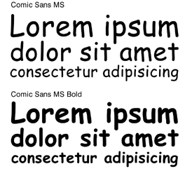
The second speaker, Heather Noel Turner, presented remotely via Skype. Her presentation, “The Rhetorical Lives of Comic Sans,” explored the intense hatred shared by designers and users alike for the font. Beginning by reviewing the history of the font, she noted it was originally designed in 1994 for text delivered by the cartoon help icon “Microsoft Bob,” and was never intended to become an official font selection in Word. Turner provided several examples of anti-Comic Sans culture, one of which recently was the Powerpoint presentation announcing the Higgs-Boson discovery. That presentation design suffered complaints for its use of Comic Sans for communicating such a groundbreaking scientific discovery; it was considered inappropriate to use the font. Given that a common joke is that it is never appropriate to use Comic Sans, Turner questions (when) is Comic Sans appropriate, noting the intense controversy that something as seemingly innocuous as a typeface can garner.
The third and final presenter, Christopher Wyatt, discussed the need for typeface study regarding disability and access. As Wyatt noted, since a reported 11% of college students have disabilities, access and readability in type is an essential consideration. Referring to Turner’s presentation, Wyatt explained that Comic Sans is (not surprisingly) one of the worst fonts for autistic readers. However, it is frequently marketed as the best, because font publishers donate money to organizations in exchange for positive marketing—whether it is true or not. Thus, it is up to us as teachers to find out for ourselves what type works the best for our students. Wyatt explained, through examples, the importance of choosing an accessible type, as typography can encourage or block student engagement of a text. He also brought up the problems and lack of accessibility of the rigid APA and MLA typography rules. Citing research in type and disability, Wyatt illustrated how Corsiva and Verdana were the two highest-scoring fonts for readers with disabilities, as the script style of Corsiva required students to slow down and focus on interpreting the letters. This, along with other recommendations such as 14-18 point font and medium weight, was included as part of his list of type generalizations for accommodating students.
Discussion was active and productive, with discussions ranging from accessibility to the new MLA rules to (more) hatred of Comic Sans. In all, this was an excellent session, piquing the interest of anyone interested in the rhetorical nature of type.
