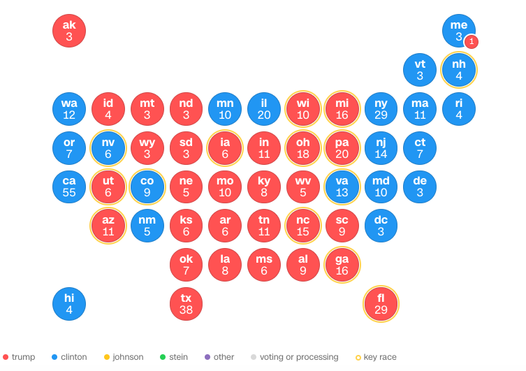
Data can be a tricky animal when it comes to politics.

One area that is particularly prone to misinterpretation (both unconscious and purposeful) is data visualization – when data is translated to (hopefully) easy-to-understand images.
The kinds of rhetorical choices made with data visualization go beyond simplistic pro-con biases to a more complex, interconnected web of highlighted (and shadowed) points. Exploring the ways information is framed in the creation and deployment of data visualization is a rich opportunity to get students thinking about rhetorical choices in a realm that many of them might consider “objective.”
This lesson plan was designed with first year composition in mind, but can easily be adapted for other subjects. Discussion is a cornerstone of this lesson, because majors in different fields have widely varied points of view on data, visualization, and deployment and will be able to speak to the subject from a variety of rhetorical situations. Finally, this lesson allows students to talk and think about the rhetorical choices in highly politicized election cycles with some analytical detachment.
In terms of theoretical framing, the classic triad of ethos, pathos, and logos is a useful starting point. For exploring election data visualization, talking about the rhetorical triad as a dialogue rather than three standalone elements sets the stage for investigating the affordances and constraints of election data visualization.
Objective: Explore and discuss data visualization as it relates to elections
Introduction: Introduce a data set to the class and ask them to study for a few moments. Then identify, first in groups then as a whole, what kind of things we “know” simply by looking at this data set.
This doesn’t need to be tricky or complex; the point is to dig into the raw data and understand just how much information we can get when we look at a plain text table. For instance, reported voting, by age, November 2014 from Census.gov or individual income tax statistics, 2014 from IRS.gov are both filled with information but not overly complex.
If neither of these appeal to you, Census.gov has many other data sets. Alternate resources include Data.gov, Kaggle.com, and the Social Security Administration has an interesting sub-site of popular baby names going all the way back to the 1880s.
Lesson: Use a table of national election (electoral) results to replicate a quick version of what you did in the introduction (Dave Leip’s uselectionatlas.org is a good resource, and your institution may have access to clean tables via your library). Study the numbers for each state and discuss, as a class, what kind of things you “know” by looking at this data.
Then spend some time looking at data visualizations of the 2016 elections from various sources (suggestions below), with attention to the information that is being highlighted and shadowed by the visualization. Here, it’s useful to ask of every visualization both what is notable or exceptional, and what is missing, downplayed, or otherwise left out.
• WSJ.com: Election results 2016
• CNN.com: 2016 presidential election results visualization
• Bloomberg.com: 2016 presidential election results visualization (allows you to sort by county as well as state)
After you’ve studied the various tables and complementary visualizations, look at some of the predictive visualizations leading up to the 2016 election. This is the time to ask questions like where is the data coming from? How reliable is that data? What kind of data might have been “shadowed” or ignored in these kinds of visualizations?
• University of Virginia’s Center for Politics: Sabato’s crystal ball “Our final 2016 picks”
• Time: Electoral college predictions
• Princeton: Electoral college map (interesting size distortion for state “weight”)
Finally, talk about the ethos, pathos, and logos of these visualizations in comparison to the existing (or imagined) data sets. If a data table seems more logically reliable, what does a visualization gain by losing some of that reliability? Which visualizations seem the most trustworthy, appealing, or questionable, and why? What do we respond to emotionally?
Make an explicit connection between rhetorical moves to highlight (or shadow) information and the relative ease of rhetorical manipulation in visualizations vs. data tables.
[An alternative to conducting this sequence as a class is to separate the class into at least three groups and have them look at data tables, visualizations, and predictions as smaller groups.]Activity: Invite students to create a complimentary visualization to a given data set. I recommend localized sets, either from Census.gov Quick Facts or from your local municipality. This activity allows them to enact the rhetorical choices and manipulations you’ve just identified. It also gives alternative learners a way to comprehend the lesson objective.
Arrange the class into groups of three to five students. Provide them with tools for visualization. This can be paper/markers or a computer sketching program, depending on your resources.
Ask groups to consider their rhetorical focus as they plan and create their visualization. What about their given data set do they want to emphasize? What can be ignored?
After the visualizations have been created, ask each group to share their data set and their resulting visualization with the class.
Conclusion: Close with a brief discussion to answer the question, “what kinds of things can we say about data visualization as it relates to politics, especially elections?” Here it will be helpful to reinforce the notion that both data and complementary visualizations are subject to the same kinds of rhetorical moves we observe in so much else regarding elections. Encourage your students to critically analyze the data visualizations they see in the next election cycle, keeping in mind the things you’ve discussed here.
