As many scholars have observed, mobile and networked devices have made it necessary to rearticulate a range of writing concepts including the relationship between place and process (Pigg); usability and access (Porter); the boundary between extracurricular and curricular writing (Fishman and Yancey; Mueller); and even the rhetorical situation itself (Walker et al. 329). Although these are just a sample of calls for the reconsideration of what it means to write in a mobile and networked society, the breadth of these calls suggest that the texts produced in and for mobile devices have had far-reaching effects on how readers and writers make meaning. Extending these considerations, my contribution to this blog carnival considers the significance of display in terms of how texts are designed to display across a range of differently-sized devices (smartphones, tablets, ereaders, and laptops) and how current practices in digital publishing might impact meaning-making.
Display across Device
In Writing Studies, form and content are theorized as dialectical through concepts like genre (Devitt), visual arrangement (Delagrange), and coherence (Yancey). Online, form and content remain separate issues, and that separation is hardcoded into the files and coding languages that are rendered into visuals by web browsers and apps (Riley). Early in the history of Web 2.0, the separation of form and content through XML allowed the syndication of data and data exchange—a kind of circulation of texts—across multiple sites (“XML”). In his webtext, “The Machine is Us/ing Us” Michael Wesch makes an argument for the value of form and content separated through the XML by highlighting some of the affordances of XML like RSS feeds and user-created metadata.
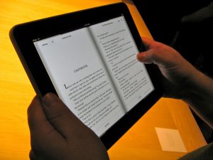
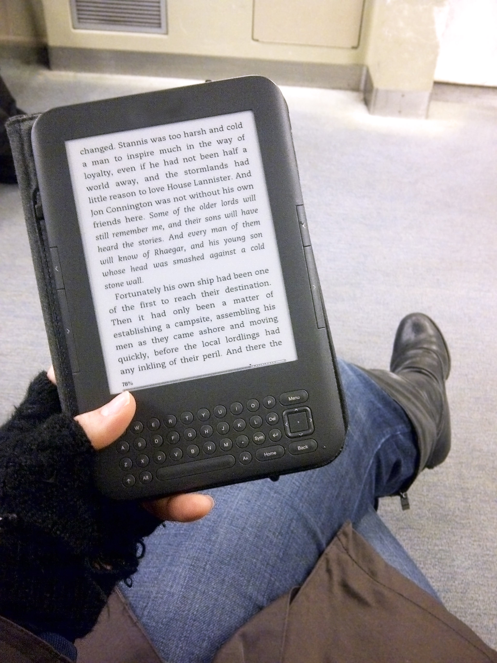
 More recently writers and publishers have used XML-based technical standards and file formats like EPUB—a format that reinforces the split between content and form online—to facilitate the distribution of texts across displays (“EPUB”). The distribution across devices is achieved by creating layouts that adapt to the dimensions of a device rather than a stable visual arrangement of word and image such as found in PDFs. In practice, this has multiple effects, but perhaps the most telling is how location is defined in ebooks. For instance, a Kindle user may flip their simulated page to the next location, but the same flip on an iPad may send that user to an entirely different location.
 Although texts published in EPUB formats lack a design in the traditional sense (i.e, .a stable layout), they are designed to create a specific effect: a readable display regardless of the screen size of the device (Craig). In contrast, the majority of new media scholarship—such as that published in Kairos—asks readers to interact with both form and content while making meaning, to look at and through the interface because the interface acts as a semiotic resource integral to meaning-making (Lanham 267). Susan Delagrange’s “Wunderkammer” and Anne Wysocki’s “A Bookling Monument” exemplify this approach because the argument communicated linguistically in both texts is enacted in the text’s form; in other words, form functions as a kind of content. In contrast, RSS-based approaches to digital publication render the interface transparent once again.
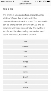
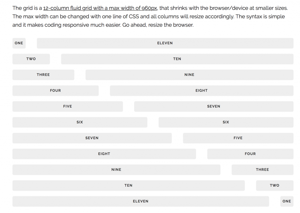
Although EPUB exemplifies a continued split between form and content to create device-specific digital displays, the separation of form and content to create reliable layouts is not unique to long-form works published in EPUB. Templates offered in web building platforms like WordPress and Wix come with a mobile layout, and there are a range of open source templates available that writers, developers, and publishers can freely use to create mobile or device-responsive layouts. One is the Skeleton CSS Boilerplate which relies on a 12 column grid. When coding a site with the Skeleton Boilerplate, the page is structured like a table where rows are defined in the HTML file though a <div> tag, <div class=“row”>, and the width of each column is defined through another <div> tag, <div class=”six columns”>.
 On larger screens, the columns in a row are displayed side-by-side, but when the page is displayed on a smaller screen like a smartphone, the columns collapse into still-more rows, doubling the number of rows displayed on the page. This row-and-column technique of mobile web design is the new “hidden understructure” of web pages used to “determine the placement of text and images in the space of the page” (Trimbur and Press 103).
The New York Times mobile site is one that uses the reflowable row-and-column technique. In contrast to the desktop site–which still relies on the multi-column grid developed in and for print newspapers–the New York Times mobile site has the appearance of a social media feed: individual messages are arranged in a single column that come in a consistently patterned sequence of feature image, article title, and article summary with divider lines and whitespace distinguishing one story from another.
Although publication through the web is much more specified than in ebooks because there is a defined desktop site and a defined mobile site, consideration of how texts are coded for distribution and circulation across devices suggests again that the primary focus for publishers and web developers is to create readable texts rather than unlocking and utilizing the semiotic potential of the interface.
Meaning-Making on Mobile Devices
Before ereaders and other mobile devices became popular choices for reading, texts were published in relatively few versions: print in its various editions and digitally for desktop monitors. However, the rise of mobile devices has diversified what versions are available to readers—each with a different display created for differently sized and differently oriented screens. In a room of 20 readers, there might be multiple versions of a text: one in print and many digital versions displayed on laptops, on ereaders, on tablets, and on phones. Combined with the option for reading in print, the possibilities for multiple digital displays suggest a set of pertinent questions useful for further considerations of reading as a visual-material and device-specific practice: How do different displays create different reading experiences? And what are those experiences? How do differences in reading experiences affect meaning-making? ¹
Endnotes
- These issues of device and meaning-making are considered in depth by Kathleen Yancey, Michael Spooner, Matt Davis, and Jacob Craig in Patrick Sullivan, Howard Tinberg, and Sheridan Blau’s forthcoming book Writing Teachers Teaching Reading.
Works Cited
Craig, Jacob W. “Print Made Fluid: Design, Format, and Attention in a Convergence Culture.” The Tablet Book. Eds. Caroline Bassett, Ryan Burns, Russell Glasson, and Kate O’Riodan. Sussex, UK: Reframe, 2015. 83-111. Web.
Delagrange, Susan. “Wunderkammer, Cornell, and the Visual Canon of Arrangement.” Kairos: A Journal of Rhetoric, Technology, and Pedagogy 13.2 (2009). Web.
Devitt, Amy J. “Generalizing about Genre: New Conceptions of an Old Concept.” CCC44.4 (1993): 573-86. Print.
Fishman, Teddi, and Kathleen Blake Yancey. “Leaning Unplugged.” Going Wireless: A Critical Exploration of Wireless and Mobile Technologies for Composition Teachers and Researchers. Ed. Amy C. Kimme Hea. Cresskill, NJ: Hampton, 2009. 35-53. Print.
Lanham, Richard A. “The Electronic Word: Literary Study and the Digital Revolution.”New Literary History20.2 (1989): 265-90. Print.
Mueller, Derek N. “Digital Underlife in the Networked Writing Classroom.” Computers and Composition 26.4 (2009): 240-50. Print.
Pigg, Stacey. “Emplacing Mobile Composing Habits: A Study of Academic Writing in Networked Social Spaces.”i>CCC 66.2 (2014): 250-75. Print.
Porter, James E. “Recovering Delivery for Digital Rhetoric.”Computers and Composition 26.4 (2009): 207-24. Print.
Riley, Brendan. “A Style Guide to the Secrets of <style>.” From A to <A>: Keywords of Markup. Eds. Bradley J. Dilger and Jeff Rice. Minneapolis: U of Minnesota, 2010. 67-80. Print.
Trimbur, John, and Karen Press. “The Page as a Unit of Discourse: Notes Toward a Counterhistory for Writing Studies.” Beyond Postprocess. Eds. Sidney I. Dobrin, J. A. Rice, and Michael Vastola. Logan, UT: Utah State UP, 2011. 94-116. Print.
Walker, Janice R., Kristine L. Blair, Douglas Eyman, Bill Hart-Davidson, Mike Mcleod, Jeff Grabill, Fred Kemp, Mike Palmquist, James P. Purdy, Madeleine Sorapure, Christine Tulley, and Victor J. Vitanza. “Computers and Composition 20/20: A Conversation Piece, or What Some Very Smart People Have to Say about the Future.”Computers and Composition28.4 (2011): 327-46. Print.
Yancey, Kathleen Blake. “Looking for Sources of Coherence in a Fragmented World: Notes toward a New Assessment Design.” Computers and Composition 21.1 (2004): 89-102. Print.
Yancey, Kathleen Blake, Michael Spooner, Matt Davis, and Jacob Craig. “Device. Display. Read: The Design of Reading and Writing and the Difference Display Makes.” Writing Teachers Teaching Reading. Eds. Patrick Sullivan, Howard Tinberg, and Sheridan Blau. (forthcoming)


2 Comments
You bring up some very interesting questions at the end of your piece. At my own University, we’ve been contemplating a move to e-books. Because of accessibility issues, this idea seems to have been shut down, though some classes still allow students to have their books on digital devices (a few instructors choose to have technology-free classrooms: an interesting idea of “accessibility” from another viewpoint–if books are cheaper, and thus more accessible, via a digital device, and then you forbid digital devices, are you not limited accessibility in the same way that a switch to e-books would?–a question for another time). But your questions have made me think about my own students who use digital devices to access their books. I have no policy against this, and students are welcome to use digital devices in my classroom. But what I admittedly hadn’t considered was how accessing the textbook on a digital device might change how students perceive the meaning of the text: for example, like your mention of how content is resized on mobile devices, how differently might something be perceived if an image is stacked above the text that describes it, rather than beside it? Thank you for your contribution!
Thanks very much for your comment, Sara. Your point about accessibility is right on. You also mentioned course policies which are an interesting aspect of this. I’ve seen several to the effect of no laptop, no ereader. I can see the thinking behind a no laptop policy, but I haven’t quite gotten a handle on the rationale behind a no ereader policy. I wonder if it’s a ramped up version of print nostalgia or if it presupposes issues of meaning-making.