Reflect
In late August 2013, the Merion 174 classroom renovation was complete, just in time for classes. The process took one calendar year, as we started the production process in August 2012. By sharing our design philosophy and classroom sketches with administration, we were able to develop a teaching and learning space that suited our needs. Collaboration with IT refined those ideas, making the classroom even more ideal for collaborative teaching and learning. The project reflects a collective approach to collaboration and creative problem solving.
The photographs in figures 2.12–2.17 demonstrate how students and faculty are using the renovated classroom, including the work stations, gaming/focus group area, Sound Domes, and ClassSpot.
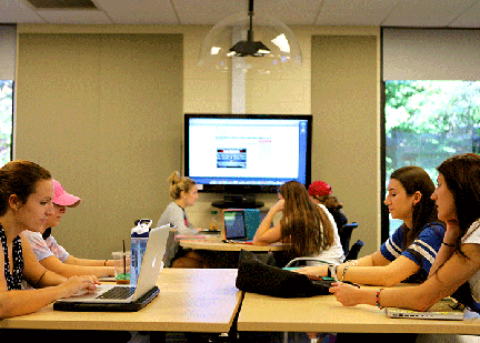
In the article “Making Peace with the Rising Costs of Writing Technologies: Flexible Classroom Design as a Sustainable Solution,” Susan Miller-Cochran and Dana Gierdowski (2013) reported that “in computer classrooms, the technology tethered us (sometimes literally) to a specific classroom design” (p. 52; in chapter 3 of this volume, Gierdowski and Miller-Cochran further discuss this flexible classroom design and student expectations for such instructional spaces). We too believe that technology should not dictate classroom design, which is why we opted for a BYOD (bring your own device) model. Our Communication and Digital Media program requires laptops for all majors. Theoretically, the twelve laptops provided in the stationary laptop cart are for our minors. Our design philosophy dictates that technology should be ubiquitous yet unobtrusive.
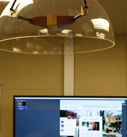
The Sound Domes installed in the classroom (see figure 2.13) have directional speakers that localize sound. They focus the sound for small groups directly under the speaker dome, which keeps the overall classroom noise level to a manageable level. The new space has a significant impact on how we teach. We place an emphasis on collaboration in our design philosophy: Collaboration with our students, each other, and the community. As collaboration is part of our mission, we are constantly learning what that means, pedagogically. To make the most of the classroom, including Tidebreak’s collaborative software ClassSpot, we must design our lessons with collaboration in mind.
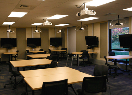
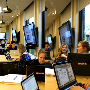
Although the white board screens in the focus groups area were a compromise, they work well—perhaps even better than the original idea to separate the areas by glass walls. Not only would the glass walls have almost doubled the cost of the renovation, due to HVAC, they might not have been the best solution for our pedagogical needs. The white board dividers are not only useful to write on, but are mobile. The privacy they offer is adequate for our needs.
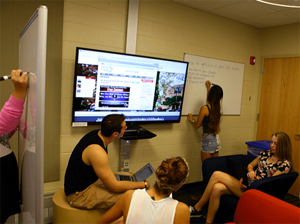
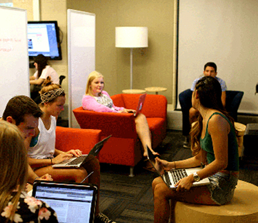
Our finished classroom is now a showpiece for our university. The admissions office takes potential students and their parents through the classroom while on campus visits. Curious instructors and students come by to have a look. The room is always occupied; when class is not in session, the classroom is used for digital media labs and digital writing consulting.
We now find ourselves promoting an awareness of the role of learning space design on campus. We help other departments craft design philosophies that support clear visions to make changes in classroom design, most recently assisting faculty in their argument for flexible Steelcase Node chairs to redesign a first-year seminar classroom. Due to the success of this project, we are now beginning a faculty research initiative on campus to promote the Scholarship of Teaching and Learning (SoTL), especially in the areas of learning space design and learner-centered teaching methods.