Design Recommendations
A gap exists between what researchers know about designing inclusive online spaces and the designs of many virtual writing spaces. Writing instructors and writing center administrators often lack direct control over the designs of the virtual spaces in which they teach (Rubens and Southard 2005). Colleges and universities seem to prefer commercial learning management software solutions, with 60 percent of institutions using software from Blackboard (Kowitt 2009). Predesigned solutions, whether commercial or open source, often lack the flexibility a virtual writing space should embrace.
As stated earlier, trying to recreate physical writing spaces in virtual settings overlooks the differences between the two settings. Unfortunately, much of the literature on virtual spaces reflects a bias toward recreating the social cues and norms of physical interactions (Byron and Baldridge 2007; Hawisher and Pemberton 1997; Hawisher and Selfe 1991; Kreijns et al. 2004; Lee 2007; Mayer et al. 2003; Nicol, Minty, and Sinclair 2003; Sia, Tan, and Wei 2002; Swan 2002; Tanis and Postmes 2003; Tu 2002; Walther, Loh, and Granka 2005). Clinging to metaphors and biases from physical spaces limits our ability to craft inclusive online spaces. Research indicates that “the social context of online learning is qualitatively different from face-to-face learning and that this has significant implications for online learning design” (Nicol et al. 2003, 270).
Use Resources for Accessible Design
Crafting an accessible space requires knowledge of both web standards and legal requirements. Before designing virtual writing spaces, visiting several online guides to accessible design will benefit instructors and writing center staff. One of the best resources for educators is the Web Accessibility in Mind (WebAIM) project hosted by Utah State University. Table 4.2 presents accessibility resources.
| Title | URL | Description |
|---|---|---|
| Web Accessibility in Mind | http://webaim.org/ | WebAIM consolidates materials on best practices, Web standards, and compliance for accessible design. |
| WAVE Interactive | http://wave.webaim.org/ | WAVE Interactive allows visitors to test any public URL against Section 508 mandates and WAI standards. |
| WAVE for Firefox | http://wave.webaim.org/toolbar/ | A version of WAVE for the Firefox Web browser. |
| Section 508 Official Site | http://www.section508.gov/ | The Section 508 site features current regulatory guidelines for accessibility. The content is updated whenever new regulatory findings are issued. |
| Web Accessibility Initiative | http://www.w3.org/WAI/ | The World Wide Web Consortium (W3C) standards for the Web Accessibility Initiative. |
| Creating Accessible Websites | http://www.afb.org/section.aspx?SectionID=57&topicID=167 | American Foundation for the Blind recommendations for accessibility. |
Make Text Primary
As discussed earlier, many adaptive technologies work by analyzing the text in a virtual space. In accessible designs, all content includes textual labels; all graphics and media files should have “alt” (alternate) tags to help users navigate the spaces. Resisting the temptation to create visually appealing sites with minimal text is important. Keep layouts simple. Multicolumn layouts, especially those based on tables, confuse some adaptive technologies.
Focus on Structure
Inclusive designs focus on the structure of documents and spaces and then address the visual appeal of layouts (Seale 2006). Inclusive content uses logical HTML tags, with cascading style sheets (CSS) controlling the physical layout. Unfortunately, some learning management systems abstract the underlying HTML and CSS code via graphical editors. Whenever possible, verify that headings, paragraphs, and other logical elements of a document are properly coded.
Recognize that Asynchronous is Flexible
Asynchronous virtual spaces provide participants additional time and flexibility to participate via email, discussion forums, journals, blogs, wikis, and other text-based exchanges (Breuch 2005). Being able to take extra time includes students with motor challenges and cognitive challenges. The flexibility of asynchronous settings also helps students with other physical limitations that might interrupt daily routines.
Test the Space
Test virtual writing spaces for best practices, using tools such as WAVE and browsers like WebbIE. Accessing the online composition course with the same tools individuals with disabilities might use, before students enter the space, must be a step in inclusive course design. One of the challenges facing composition instructors is that our classrooms are not publicly accessible; they are typically protected behind passwords and other security measures. One suggestion for testing composition courses is using WAVE locally as a web browser add-on.
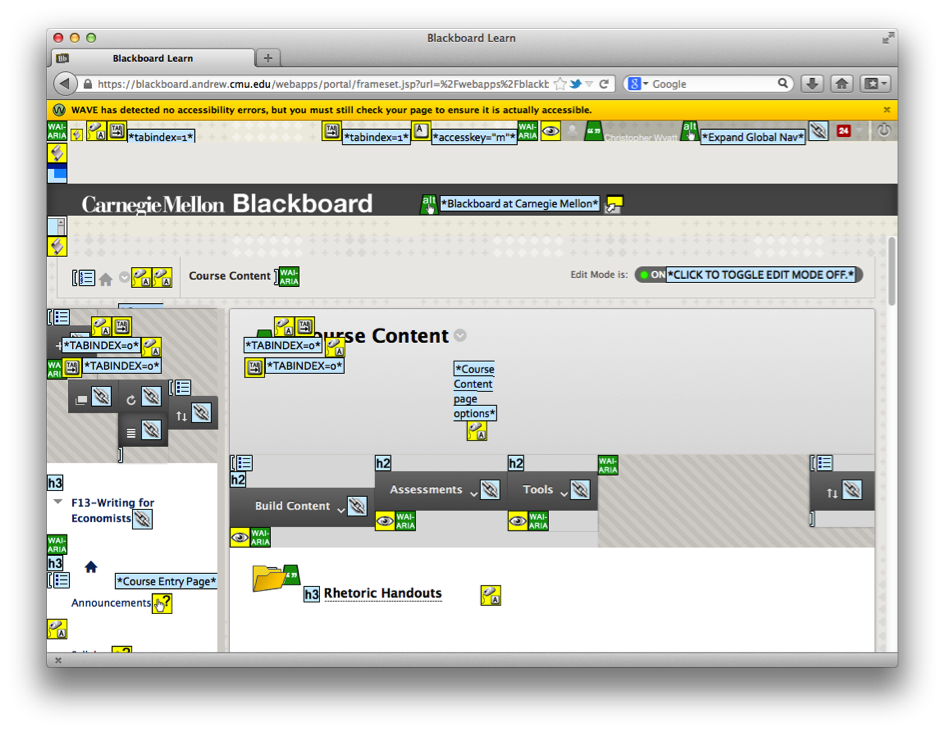
Figure 4.3 shows a WAVE report on a writing course offered to undergraduate statistics and economics majors at Carnegie Mellon University. Training and supports are provided to instructors to ensure compliance with regulations and best practices. As this image indicates, WAVE “detected no accessibility errors” in this online writing classroom. After passing a WAVE analysis, the course was tested with the WebbIE browser. Even when a site is designed carefully for Section 508 and WAI compliance, it is possible to overlook minor accessibility issue that could exclude students.

Figure 4.3: Sample WAVE report of Blackboard course
For comparison, an example WAVE text of Yahoo appears in FIgure 4.4.
Notice that WAVE detected twenty-one accessibility errors on the Yahoo main page. Many major websites focus on visual appeal instead of usability. It is tempting to create similar websites for our composition courses; our students live in the multimedia-rich Internet, not the text-based interfaces of the past.
Listen to the Community
The reality is that a virtual writing space is never finished. Students, instructors, and tutors using the site will have different experiences, ideally leading to suggestions for improvements to the design of an online composition course. Encourage members of the community to critique the virtual writing space, reflecting on what does and does not encourage thoughtful writing, collaboration, and critical thinking. If the design is acting as a barrier, make minor adjustments when possible. Sometimes it becomes clear that major changes to a virtual writing space are necessary. When that is the case, acknowledge that members of the community helped improve the learning environment.