x
Contents
Home
Home
Home

Decoupage|Tressage

In 2006 Jonathan Hickman’s The Nightly News shocked the comics industry with its antiestablishment message and nonconformist style. Coming out of a career in graphic design, Hickman created not just a new style but a new possibility for comics. His slick layouts look more like glossy magazine pages than superhero comics.
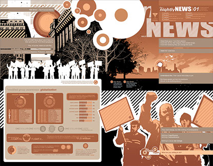
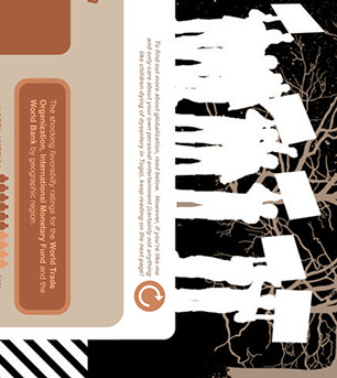
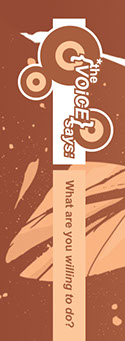
This two-page spread from issue 1 offers an example of Hickman’s a/typical layout (2-3). The text boxes in the upper left contain simple narration but look a bit more like menu bars than text boxes. Below that we have what looks like a well-designed business proposal. On closer inspection, the proposal includes disturbing facts clothed in an ironically cheerful tone: “To find out more about globalization, read below. However, if you’re like me and only care about your own personal entertainment (certainly not anything like children dying of dysentery in Togo), keep reading on the next page!” The images on this page oscillate from realistic to abstract images with a happy medium found in the stylized white outlines of protesters found standing on top of the proposal. In the upper right we find the masthead, including a table of contents for the comic. Below that the narration continues down into an image of three protesters drawn (finally) in what appears to be a fairly traditional pencil and ink comic book style (though Hickman is always generous when it comes to ink, rebelling against the principle of bounding line and embracing a kind of apeiron). The protesters’ signs are blank, but we find captions above, offering us more biting sarcasm aimed at the status quo. In the lower right we find “*the {voice} says: what are you willing to do?” “The voice says” acts as an icon, alerting us to a special kind of text, similar to the icons used throughout the for Dummies series. The text following is formatted the same as the narration above but in a different color. The entire page is fairly monochromatic, using various shades of red, pink, and orange.
Hickman's comic serves a few purposes here. First, it completely resists interpretation as sequential art. There are no panels, let alone gutters. While Hickman does use panels on subsequent pages, it is by no means the norm of the book. However, The Nightly News is obviously a comic. If we were to formally define it as a comic on the basis of its few examples of sequential panels, then any textbook that utilized comics as examples would also have to be a comic.
Second, it offers a chance to investigate Thierry Groensteen’s concepts. Groensteen utilizes the concepts of spatio-topia and arthrology (restricted in the sequence and general via tressage) to interpret comics. Hickman’s work resists restricted arthrological interpretation as it has no strips, no gutters, no strict sequence. However, it is suited quite well to the tressage of general arthrology in its repeated motifs, icons, and color (Hickman is careful and consistent in his monochromatic palettes, oscillating between the narrative present [reds] and various flashbacks [blues]) and, more obviously, to the decoupage of the spatio-topical system through its layout. However, these two criteria do not necessarily make it a comic, as they could apply equally well to other media.
Groensteen, wisely, does not seek to define comics (indeed, he quite clearly rejects any efforts to define comics quite clearly). Instead, he begins his book by offering a “foundational principle,” iconic solidarity: “The necessary, if not sufficient, condition required to speak of comics is that the images will be multiple and correlated in some fashion” (System 19). This signifies a great advance over either the sequential or the historical/cultural definition by moving toward a foundational principle, or center, and in this way guides my own pursuit. Like me, Groensteen does not seem particularly perturbed or inspired by the fact that his necessary condition could describe an issue of Sports Illustrated, a genetics textbook, or Watchmen with equal fidelity. Instead, he likens it to the frustration of trying to define literature without resorting to claims of cultural superiority or formal naïveté (that is to say, literature can be neither “good” texts nor mere words in sequence). This issue, of course, still haunts literature departments, but there have been a few compelling solutions. One is seen in the gradual expansion of literary studies to include e-texts, films, comics, plastic arts, inanimate objects, political theories, et cetera ad infinitum. How did literature manage to move itself from the margins of the humanities to its center in the latter half of the twentieth century? By defining itself through its own central practice, the production and analysis of meanings, rather than through its limits. Can comics perform a similar metamorphosis?
Bart Beaty (echoing Aaron Meskin) argues that comics should follow art’s example of defining based on field of inquiry, not on object of inquiry. Faced with a question like, What is art? various art theorists and scholars balked. George Dickie, most notably, directed scholars to concern themselves with investigating the “artworld” rather than attempting to determine limits of what is in and what is out. The artworld includes things that we typically consider art (paintings, films, sculpture) alongside those we usually do not consider (personal letters, exhibitions, museum space). The artworld is defined by our scholarship not prior to it. That is to say, if an art historian studies it, it’s part of the artworld. This pragmatic definition was meant to avoid both the quality determinations with which literature is familiar and the formal definitions with which comics have been plagued.
In this case, we must slightly correct our initial understanding of Groensteen’s foundational principle of “iconic solidarity.” Groensteen himself departs from this principle, analyzing comics not by means of iconic solidarity but primarily and throughout his work by the principles of decoupage and tressage. That is to say, a more functional definition that involves formal and social elements informs Groensteen’s work more than his initial foundational principle.
Image of Hickman pages 2-3 and details.

Kim Gunter has advocated a similar rhetorical braiding for student writing.


