x
Contents
Home
Home
Home
One way of seeing/reading the immanence-transcendence relationship is with the images of windows and mirrors. Transcendence hypothesizes a window through which the subject gazes at the object. Immanence requires instead a mirror which folds the plane upon itself. Nor does it facilitate a consistent reflection, an aedequatio. Instead, it must be convex or concave, bent like the comma separating/joining discourse, figure.
I take these images from Jay David Bolter and Diane Gromala’s Windows and Mirrors: Interaction Design, Digital Art, and the Myth of Transparency, which advocates reflexivity in information design. They first show that the current information design canon requires transparency and abhors reflexivity, prefers windows to mirrors. In the window metaphor, GUIs are transparent, showing you information as it is. This is, of course, just a myth, though a useful one, to be sure. Users rarely see information as it is (except perhaps in the most applied uses, like statistical and CAD software). Nathan Shedroff, as well as Stuart Selber, would argue that information design always carries with it the myth of transparency. The alternative would be a mirror, which reflects its own methods, capabilities, and user. Reflexive GUIs encourage users to reflect on the process itself.
Think of the relative reflexivity and transparency of Macintosh OS and Linux. For the most part, OS X is designed to work thoughtlessly. A user’s immediate impulse for getting something done should be the way that it works. On the up side, this narrows the learning curve tremendously while meeting experienced users’ gut need for a feeling of immediate control. On the other hand, Linux, an open-source, cross-platform operating system, forces users to learn how it works on a much deeper level. Rather than anticipating its users’ every move, Linux requires a bit of flexibility on its users’ part. Linux’s major advantage is its flexibility in return. Users can redesign every aspect of the operating system, customizing it to their own needs on the fly.
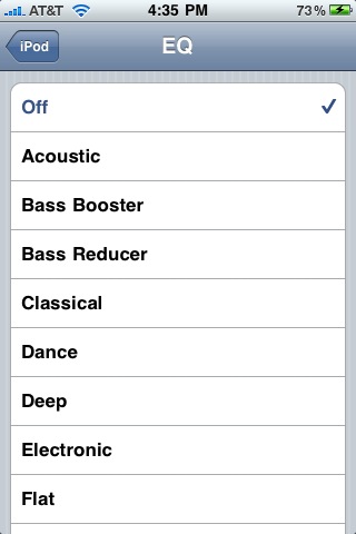
Normally, these are viewed through the lenses of usability and customizability. Usability = good. Customizability = good. Usability and customizability are assumed to be inversely related. Various information designers have found ways of splitting the difference. Think of the EQ on the receiver of a modular stereo. The more aspects users are allowed to control, the more difficult the device is to use. Apple’s designers vreinvented the EQ for the iPod by combining usability and customizability brilliantly. Rather than increasing dials, the iPod’s EQ system multiplies presets: quality over quantity in an interesting way (dials being quantitative and presets being qualitative).
Like I said, OSs are usually seen through the lenses of customizability and usability. Instead, I’d like to look through the lens of user adaptability. OS X is an incredibly stable system, but when it does crash, users are often completely helpless. They lack the tools with which to adapt to breakdowns. On the other hand, Linux crashes far more often, but its users are able to fix it. Linux gives its users tools with which to adapt. When users are taught to look only through the GUI, they internalize a technological myth: users’ desires should be met immediately; if they are not, then the machine has failed; if the machine has failed, users are inculpable. Conversely, users who are taught to look at technology learn how technology works. They realize that computers will only do what users tell them and that, most likely, if something has gone “wrong,” it is the user’s fault and can therefore be solved by the user.
Windows and Mirrors

Stuart Selber
When we are encouraged to look through technologies to our work rather than at the technologies of our work, we perpetuate the false assumption that the relationship between a technology and its design is "natural" and not conventional. Moreover, we discourage users from examining how they might modify or work around technologies that fail to support their backgrounds, educations, learning styles, and worldviews. (§ 5)
Stuart Selber offers an intriguing view of the effect of technology on technical communication. He first addresses three myths of technology: the myth of progress, the myth of access, and the myth of transparence. Technology does not produce real progress, but is a complex system with benefits and disadvantages. Merely giving everyone access to technology will not decrease the distance between the haves and have-nots. Technology does not have to aim at transparency, nor does it often achieve that goal.
Nathan Shedroff
One aspect of an experience that can make it surprising and amazing is that of confronting one’s beliefs. When we are challenged to rethink possibilities (when our beliefs and expectations are confronted by the evidence in front of our eyes) we can have a profound reaction. (6)
Nathan Shedroff replaces Information Design with Experience Design. Shedroff creates a progression, Data→Information→ Knowledge→Wisdom (34-59). Information Design works at the first two levels, using data (passive, given) to construct information (meaning). With the added dimensions an experience entails, we move from information to knowledge (deeper, personal), and occasionally to wisdom (generalizable approaches and values). Reflection makes possible the transition from knowledge to wisdom.


