x
Contents
Home
Home
Home


Difference
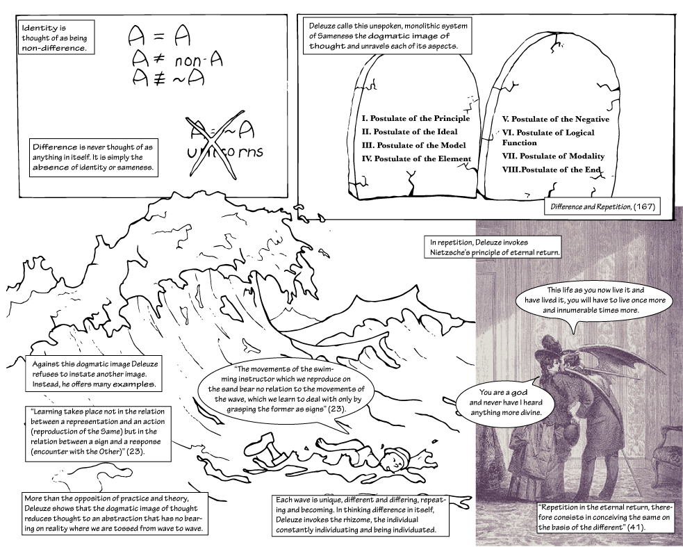
In Difference and Repetition, Deleuze articulates a theory of difference thought as itself rather than as just the absence of identity.

Throughout his work, Deleuze is afraid of instating a new dogmatic image of thought. The difficulty of his writing is due at least in part to this fear. Rather than offer an easy answer that can become mistaken for the new dogmatic image of thought, Deleuze gives us something difficult to wrestle with: a wave in which to swim. Alexander Galloway and Eugene Thacker remind us of this fear when they write, “we're tired of rhizomes” (153). Even the ultimate antidogmatic image, the rhizome, can become dogmatic.
Likewise, I fear reasserting a new dogmatic image of thought. Instead of offering a new image, this book performs its arguments in its organization, the linking between various pages, the supposedly easy linearity interrupted by shifts and jumps. For example, below you will see two links, each with an arrow, implying backward and forward motion. These links help readers to navigate the site but also seem to reinforce a linearity this project has worked hard to resist.
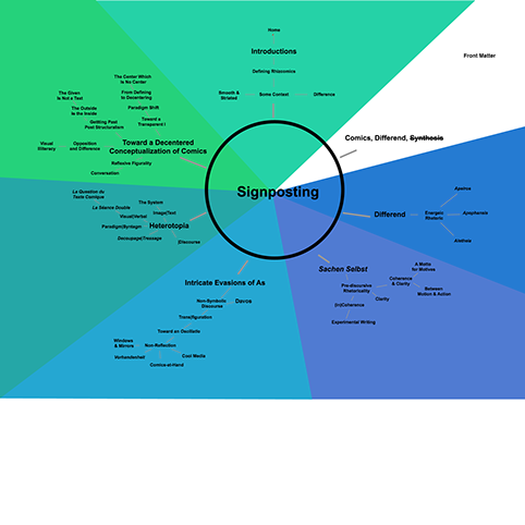
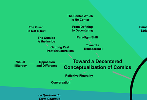
Based on comments from my reviewers, it was clear that the initial draft of this book felt disorganized. In my own mind it was actually a little too organized (especially for something with rhiz- in the title). The original table of contents was much more expressive, featuring branching sections and sub-sections, color-coded for each nexus. In other words, it was very hierarchical. After a bit of testing, I realized that what readers wanted wasn't more organization, but more of a feeling of organization. This difference is subtle but important.
I added numbers to each nexus and page and indicated asides by not including them in the numbering (as you can see in the current table of contents). Technically this includes less organizational information than the original, more expressive table of contents. However, it gives readers the feeling of a well-ordered book. As soon as I made this change, readers upon whom I tested this project immediately responded by feeling more comfortable with it.
It's important to note, though, that this project does not require the kind of linear, hierarchical organization implied by the table of contents. The various links that take readers to distant sections of the project help to break this up slightly. However, the search bar is also always there to allow readers to move around on their own. Finally, the breadcrumb trail across the bottom of the menu offers readers another way of jumping around in the book.
Like the gutter in comics, links create a connection between distinct panels or pages. The reader then fills in the relevant details of the connection. Comics generally link panels sequentially and linearly. A webtext offers the opportunity to play with this a bit. Each time you encounter a link, you're being asked to fill in a gap. For this reason, I've made the in-text links open in new windows. That way the reader can compare the two and construct meaning. For example, in the above link on the word gutter I've linked to the page entitled “Reflexive Figurality.” On that page I discuss the concept of the gutter more extensively. On this level, the link is merely informative. But what if more was implied by the gutter of the link? The alt-text on the link, “Construct a bridge,” seems to imply this. Perhaps the reader is meant to connect everything said about the gutter on that page to the linking created throughout the book and further to the term plexed artistry introduced on that page. If that is the case, then we could further make the case that the larger arguments of the entire project are contained not on the pages themselves but between them. Furthermore, such a reading would mean that the entire project is, in a sense, included in that single link. Of course, that would mean that a reader would be unlikely to find an explicit reference to those larger arguments in the text, so this will have to remain purely hypothetical.
One final way of looking at these links, then, is as one more Deleuzian swimming lesson. Rather than describe the project (as the above paragraph fails to do), the experience itself creates the project. Of course, this can leave readers with the feeling of being thrown in the deep end (or even the ocean, to continue Deleuze's example).
As you look at the forward and back buttons below, think of them not as commands but as a lifeline for those uncomfortably adrift. For those more comfortable with drifting, consider taking the other paths allowed by the book, each time assuming the link is an intentional gutter supplying a gap in which meaning can be found or constructed.
This page also appears in my recent article for Digital Humanities Quarterly, “Is This Article a Comic?”


Original table of contents.
Detail from original table of contents.

